U.S. Foreign Assistance Dashboard Can’t Be Everything To Everyone
Guest post by Laia Grino, Interaction.
The Foreign Assistance Dashboard is about to go through a redesign process. Recognizing that it has a diverse audience with many different interests, the Dashboard team plans to consult a wide range of stakeholders, including in-country partners. For this, they deserve credit.
The trick, however, will be not to fall prey to the illusion that it is possible to design one site that will serve everyone’s needs. Instead, the Dashboard team should use this as an opportunity to rethink its approach to making data accessible: simplify the intended audiences for the Dashboard itself and collaborate with others to meet the needs of additional audiences.
Pick (and get to know) your audience
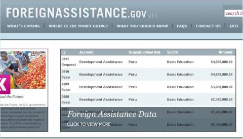
The goal of the Foreign Assistance Dashboard is to present U.S. foreign assistance data in “an accessible and easy-to-understand format.” This is a worthwhile goal. The problem is that the Dashboard is trying to do that for too many and very different types of audiences: “U.S. citizens, civil society organizations, the Congress, U.S. Government agencies, donors, and partner country governments.”
Start thinking about what types of information these different groups might be interested in, and you quickly realize how difficult it would be to visualize data in a way that would cover all those information needs. Congress, for example, is primarily interested in aid at a macro-level: How much aid? To which countries and sectors? Under which accounts?
A parliamentarian in a partner country, on the other hand, needs more micro-level data: detailed information on specific projects being funded in his or her constituency. Civil society advocates in those countries need similarly detailed information to determine whether aid is reaching communities and to hold their governments accountable.
To date, whether intentionally or unintentionally, the Dashboard seems to have been designed for a U.S. audience. This is a legitimate choice; other donors, such as DFID, have also chosen to prioritize a domestic audience for their aid platforms. To serve this audience well, however, that choice needs to be intentional. This will make it much easier for the Dashboard team to get to know its audience and to identify the improvements that need to be made.
Focus on quality and support other tools
In its consultations, the Dashboard team will no doubt get feedback that it needs to focus more on local actors’ information needs – and rightfully so. But this doesn’t mean that the only way to serve those needs is to build more features or data visualizations into the Dashboard.
The Dashboard is not just a tool for visualizing data – it is also the sole mechanism through which the U.S. government publishes data to the International Aid Transparency Initiative (IATI) Registry, which also includes data from other donors and organizations. Because data on the IATI Registry is in a comparable, open format, organizations around the world are already working on developing tools to visualize this data.
What does this mean for the Dashboard? First, that more energy can go into making timely, high quality data available. This is actually the Dashboard’s most important role since the utility of any tool depends on the quality of the data. Most agencies still have a long way to go in terms of producing the kind of detailed information that local actors need, such as sub-national location data and information on results.
Until those gaps are addressed, investments in making the data accessible to these audiences will have limited impact. USAID is currently conducting three aid transparency country pilots to assess the usefulness of the aid information the U.S. government is making public. The results from this pilot, which the Dashboard team is following, should help the U.S. government identify where attention is needed most.
Second, it means that the U.S. government can simply join or support existing efforts to address local users’ needs, rather than have the Dashboard team build solutions from scratch. The IATI Secretariat, for example, is supporting efforts to automatically feed IATI data into countries’ aid information management systems (AIMS). Donors are also piloting the budget identifier to allow partner countries to link aid information to national budgets.
As the largest single donor, the U.S. government should actively participate in these types of initiatives, which – by allowing local actors to pull in information on all aid flows (not just U.S. aid) – will be much more useful. The U.S. could also set aside some of the money intended for Dashboard development and establish a small fund to support local infomediaries that can develop platforms and tools for specific audiences (including in other languages), or that can train people to use data.
To have an impact, aid data needs to be widely available and accessible to different audiences. But one organization can’t do it all.
Rather than think about the Dashboard as the sole platform for disseminating U.S. aid information, the Dashboard team should think about it as one of the many ways in which the U.S. government is working to get its data in the hands of the people that need it.
 Laia Grino is the Senior Manager of Transparency, Accountability and Results at InterAction. Blog originally found here.